
Understanding Colour for Photographers
by Dr. Robert Berdan
March 25, 2017

Bearberry creates brilliant reds in Autumn on the tundra
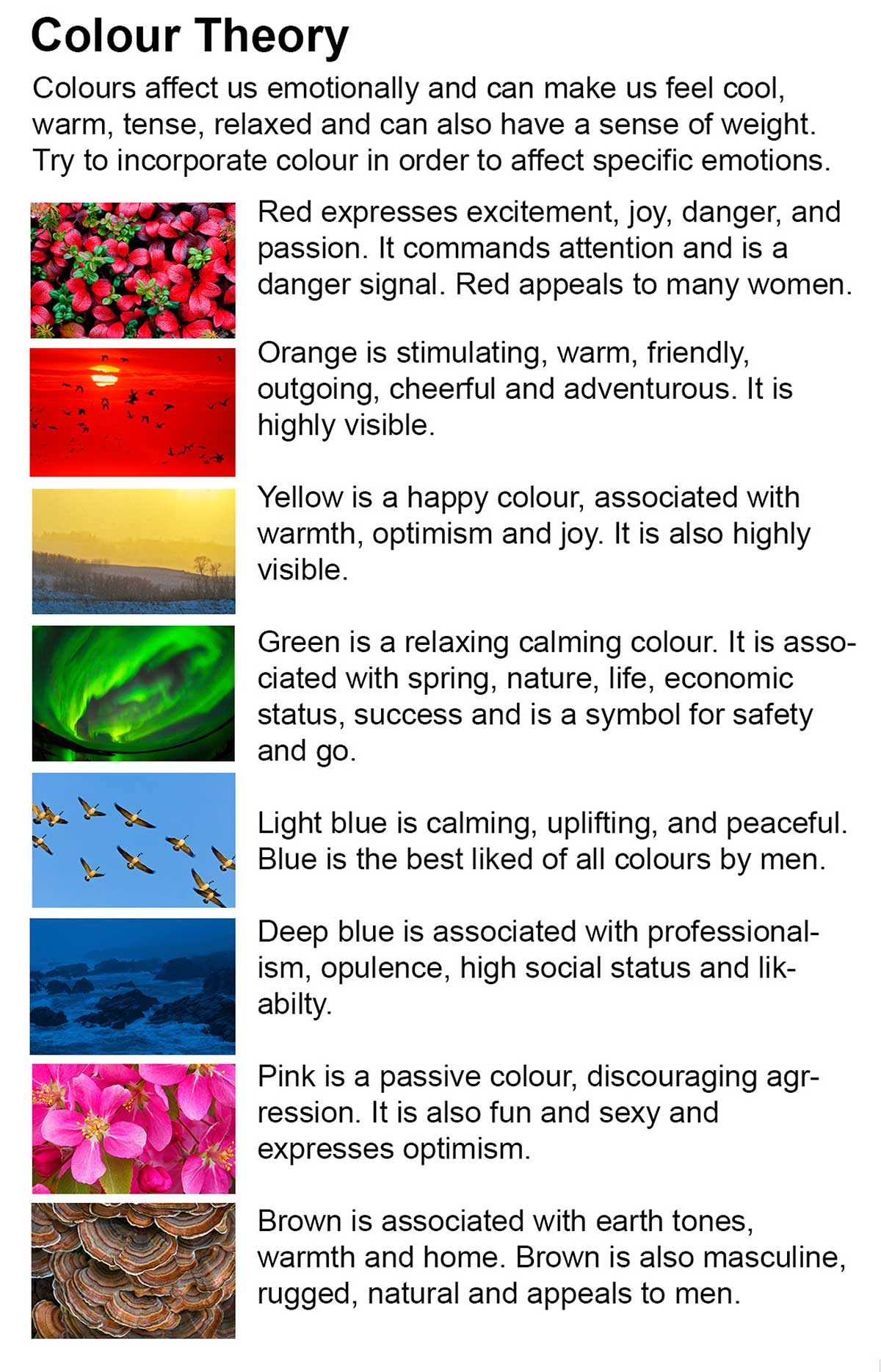
There has been a tremendous amount of research done on how colour affects human beings, with many of the findings suggesting that men and women may respond to colours differently, as do different cultures. Colour affects us emotionally, with different colours evoking different emotions. Our perception of a single colour also depends on the adjacent colours. Understanding how to choose certain colours for inclusion in your photographs can help you make more expressive images.
The vocabulary of colour includes:
Hue: refers to the names of the primary colours, red, green and blue etc.
Value: lightness and darkness of the colour, determined by the amount of white or black added.
Intensity: the purity or saturation of the colour.
Monochromatic colour: use of one colour where only the value of the colour changes.
Analogous colours refer to colours that are close together on the colour wheel (similar) and seem to “get along”. Also called harmonious, analogous colours are often used in visual design to create a soothing affect.
Complementary colours: colours opposite to each other on the colour wheel (e.g. blue-violet and yellow) represent colours positioned across from each other on the colour wheel. Complementary colours exhibit more contrast when positioned adjacent to each other: for example, yellow appears more intense when positioned on or beside blue or violet.

Different Hues make up white light

Colours are also referred to as warm or cool because of our association with various elements in our surroundings. Red, yellow and orange are considered warm colours, whereas blue, green and violet are considered cool colours. These contrasts are relative, since yellow-green appears cool next to red, orange or yellow, turning warm when placed next to blue-violet. Photographers can position different colours in an image to maximize contrast between them and also to provide perspective. Perceptually, cool colours tend to recede into the distance, whereas warm colours appear to advance forward.

Pastel colours reflected in this pond suggest a tranquil feeling

Pelagic Goose Barnacles attached to an old stump - their blue colour adds mystery to those unusual organisms.

Sarrail falls in Kananaskis - the green and blue colours have a calming effect in this picture
In graphic design and marketing, colour is widely used to express certain moods and stimulate specific behaviours. Understanding how most people react to specific colours can help you create and compose pictures that affect the mood of your photographs. Bright colours like red can be used to draw attention to a subject. Colours also tend to become less saturated with distance from the camera due to aerial perspective, and this effect can be used to suggest distance or depth in a picture.

My father wearing red attracts the eye in this picture - Red Rock Coulee, Alberta

Above the red house also attracts they eye which the fence leads to - Twillingate, Newfoundland
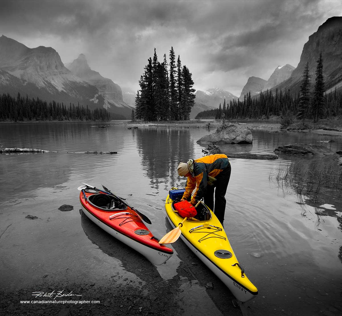
Bright colour of these kayaks pop out of the background which I made black and white to enhance the effect. Spirit Island, Jasper National Park, AB

Complimentary colours of moss and orange leaves on this Crabapple tree - West Coast, BC.

Fall colours at Oxtongue river in Ontario
Colour can affect us emotionally, next time you are out taking photographs think about how you might use specific colours to impart certain emotions into your photographs. RB
Authors Biography & Contact Information

Robert Berdan is a professional nature photographer living in Calgary, AB specializing in nature, wildlife and science photography. Robert offers photo guiding and private instruction in all aspects of nature photography and Adobe Photoshop training.
Email at: rberdan@scienceandart.org
Web site: www.canadiannaturephotographer.com
Phone: MST 9am -7 pm (403) 247-2457.
Click on the buttons below and share this site with your friends