
The Art of Seeing and the Visual Elements of Design
A Guide to Composition in Photography
by Dr. Robert Berdan
December 21, 2018

Eagle in early morning fog in the Great Bear Rainforest, British Columbia.
For most of us, knowledge of our world comes largely through sight, yet we look about with such unseeing eyes that we are partially blind.
One way to open your eyes to unnoticed beauty is to ask yourself, "What if I had never seen this before? What if I knew I would never see it again?” Rachel Carson
Just as you cannot see what you do not know, you cannot photograph what you cannot see. Seeing things is directly linked to our state of mind and knowledge. If you are not aware that a given animal or plant exists, chances are you will never see it. Therefore, there is no such thing as too much reading, preparation and research before going out into the field. If your interest is lichen, wildflowers or insects, learn as much as you can about them before you head out with your camera. The more you know about your subject, the greater your chance of success. This is especially true for wildlife. You need to know where to look for it, in which habitat you have the best chance of finding it, and what is the best time of season to find it. In short, the more you know about the subject, the more you are actually likely to “see” on your travels.
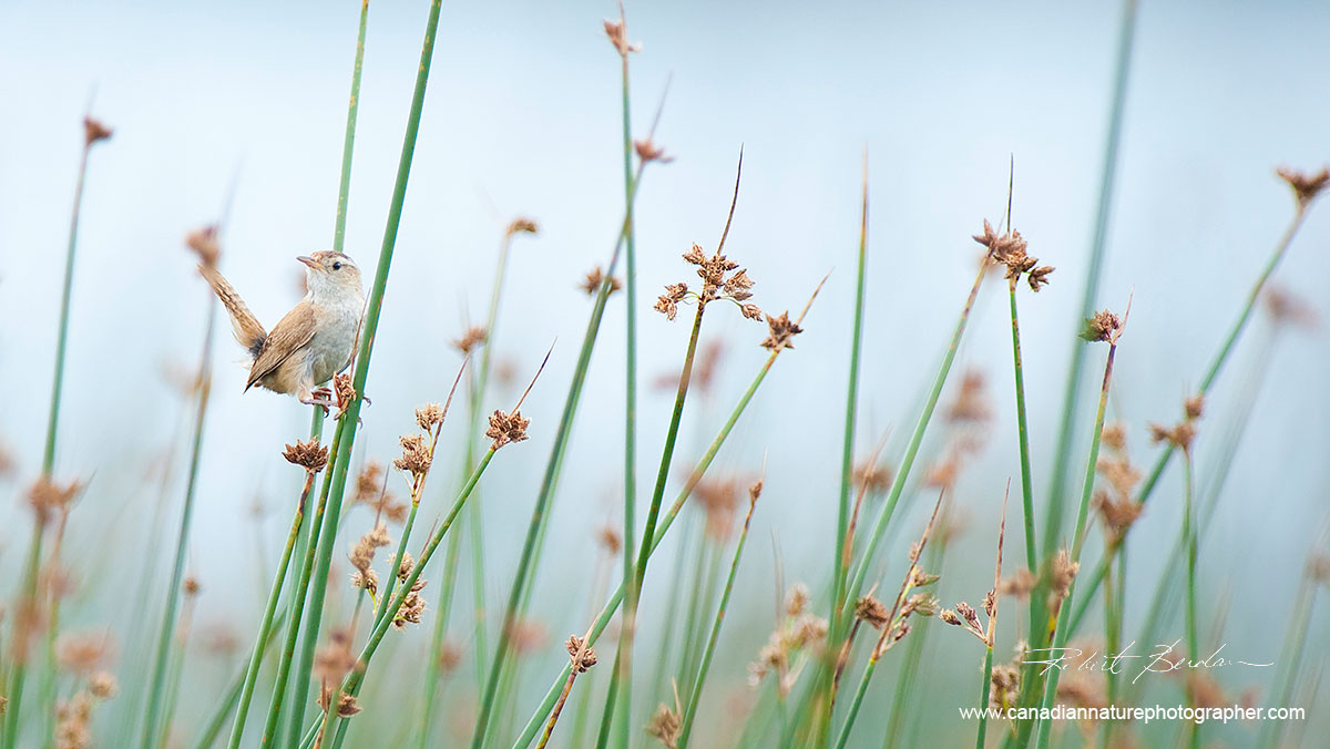
Marsh Wren (Cistothorus palustris), Namaka Lake, AB.
Although seeing is something that comes naturally, whenever we take photographs we become conscious about what we are looking at. The truth is that you do not need your camera with you to practice seeing, which you can do any time you are relaxing on a park bench or having lunch. Look for interesting or unique design, shapes and forms, focusing your eyes on small details and ask yourself if you can see things with some photographic merit. In addition to finding new things all around you, this is also a fun and therapeutic way to distract yourself from other stressful tasks in your daily life. Another way to improve your seeing is to look at visual art in books and galleries – paying particularly close attention to the works of talented painters and other photographers. Critically examine the artist’s use of colour and composition, and pay close attention to those works that affect you personally. Many artists of note started out by imitation – looking and studying the works of the artists they admired and emulating them. Eventually, you will develop your own style through the way you approach photography. And while some photographers jealously guard their secret spots, no two photographers will ever take the same picture unless they stand shoulder to shoulder and use the same lens at the same time. While some popular tourist spots and destinations may only offer a narrow space for taking photos, you are still able to take many different pictures from the same location by choosing different times of the day or unusual angles. The key thing is to use your imagination to its fullest, or risk ending up with clichéd, dime-a-dozen images that have been done countless times before.

Great Gray owl in flight
To understand how your camera “sees”, it is important to spend time looking through your camera’s viewfinder. Things look different through your camera without your stereovision – the objects seem smaller and a frame bounds them. Better cameras tend to have bigger and brighter viewfinders. Large-format cameras have the ultimate viewfinder, but the image is positioned upside down, and requires a dark cloth to see the picture on the ground glass. If you own a macro lens, you can discover a new world just be lying down in the grass and viewing things up close. Another reason things look so different in your viewfinder is that the depth-of field may be very shallow – especially when using a macro or telephoto lens. As you move closer to your subject, the background tends to go out of focus because most cameras today have the lens set to its widest aperture by default. In short, understanding how your camera sees things takes time and practice.

Caribou on the tundra in the Northwest Territories.
The viewfinders on compact cameras are usually so small that they are generally only useful for rough framing. Some digital cameras offer a "Live View" on their rear LCD (liquid crystal display) screen where you can see the scene before you take a picture. While the Live View feature is wonderful indoors, the screen is usually not bright enough to see clearly outside in the middle of the day. I use the Live View feature when I need to focus on stars in the dark by zooming in and focussing on a bright star until it appears as a tiny pinpoint. If your camera has a depth-of-field preview button, use it. The screen will get darker, and subjects that are out of focus will often come into focus and become more visible. Sometimes, closing down the lens this way will also reveal possible distracting highlights in your picture composition. Not all cameras have a depth-of-field preview, so check your camera manual to see if you have one and to learn how to use it.

Spirit Island Jasper National Park, AB at sunrise.
When framing a picture, always check the frame edges to see if there is anything in the picture that should not be there. For landscape and macro-photography, the most important camera accessory you can own is a tripod. Setting your camera on the tripod forces you to slow down and compose more carefully. Take your time, ensure the horizon is level, and check for any distracting elements around the edges of the frame. The difference between a good shot and a great shot can often come down to moving your camera a few inches one way or the other. Even as you drive from place to place, looking through your car windshield is comparable to looking at the world through a frame.
"Years before it ever occurred to me that one could have a life as a photographer, I had become accustomed to looking at the world through a frame. The frame was the window of our family's car as we travelled from one military base to another." Annie Liebovitz

Silhouette of photographer at Spirit Island, Jasper National Park, AB at sunrise.
Have you ever noticed that when listening to music, closing your eyes can often make you hear better? It’s common to see blues, jazz and solo musicians close their eyes when they play their instruments and improvise. Also, people who lose their sight find that their other senses, especially hearing, improve. I believe we can enhance our sense of sight by focussing our attention on it. Turn off the radio, cellphone, stop talking, relax, focus your attention on seeing, and you will gradually begin to see more. This state of “relaxed attentiveness”, as Freeman Patterson calls it, is often easier to attain when you are surrounded by nature, where the only sounds you hear are that of the wind, waves or birds. Some folks even practice meditation as a way of sensitizing themselves. Just as true silence can be difficult to achieve in a bustling city because of background sounds, it is also difficult to see the stars at night in a city because of all the background light pollution. For me, the most relaxing sounds are that of my paddle on a calm lake, the breaking waves near the ocean, or the soft thunder of a waterfall. During winter, snow can sometimes be a wonderful noise filter. I remember one day in Banff National Park, when stepping out of my car I was greeted to an eerie silence. It was snowing heavily when I heard a soft whoosh from behind me, which turned out to be the sound of a raven’s wings beating as the bird flew past me.

Florencia Bay, Pacific Rim National Park, Vancouver Island
Sometimes it takes me a few days to quiet my mind, which is why I sometimes enjoy driving long distances – giving myself more time to acquire that cherished state or relaxed attentiveness. When a musician is performing at an optimal level, this is often called being in the flow, whereas for athletes it’s referred to as being in the zone. The same thing can happen in photography, where on some days everything around looks interesting and has great photographic potential. Quiet your mind, relax, look at what is before you with curiosity and interest, and you may discover something new and exciting to photograph. Of course, there are days when no matter what I am looking at, I can’t see anything with photographic potential in it. That’s when I like to remind myself how nice it is to be outside instead of being cooped up in the office.
Tools that promote seeing
We are all aware how a telescope or microscope can reveal things not visible to the naked eye. Having a camera with you will also encourage you to look more carefully, with your eyes suddenly revealing things simply because you are looking for something. As writer Brooks Jensen wrote in a Lensworks magazine article, “A camera is a magnifying glass for the mind”. The lens you put on the camera can also affect what you see and photograph. Macro lenses, for instance, let you explore nature up close, allowing you to discover new things, even in your backyard, you did not know were there. A hand magnifying glass is another tool that can be handy for revealing patterns and structures not visible to the unaided eye – like patterns on a leaf. A hand magnifier is also a good way to get children to start looking at things in nature. A pair of binoculars, telescope or telephoto lens can also bring distant objects in closer. I find a pair of compact binoculars to be essential in the field for most of my outings, as it helps me find birds and other animals.

Horned Grebe (Podiceps auritus) at the nest with several eggs.
Binoculars, like a telephoto lens, presents a narrow magnified view that reveals photographic possibilities by extracting and eliminating unnecessary elements from view. In Grizzly bear country binoculars can literally save your life. When driving through the prairies, I frequently stop and scan the landscape with binoculars, scouting for potential photographs of pronghorn sheep, owls and other critters. When driving in the country, it is important to stop now and then, stretch your legs, and look carefully at the surroundings. Many animals are camouflaged and thus can be difficult to see without some sort of visual aid or knowing where to look. When scouting for snowy owls, I often stop and scan the fields, fence posts, and telephone poles with my binoculars. It is far more difficult to spot wildlife when the world passes by at 100 kilometres per hour. Many folks seem so intent on getting to their destination that they forget there are many interesting discoveries to be made during their journey there.

Grizzly Bear with Salmon, Great Bear Rainforest, British Columbia.
Some photographers and painters like to use framing devices, holding them in front of their eyes to identify possible compositions. An old 35-mm slide frame, or a simple piece of cardboard with a window cut out in the same proportion as your camera frame (3:2 or 4:3) aspect ratio, can also be used. Some photographers use their hands and fingers to form a frame and look through it to discover potentially interesting compositions. Another trick some painters and photographers do is to squint, which reduces the scene before you into dark and light areas to help you identify major forms and elements in a scene. Photographers who have used different camera formats know that the size and format of a camera has a big impact on what and how we photograph. Photographers using cameras with tiny viewfinders tend to create simpler compositions because it is difficult to see details. Using a 4 x 5-inch large-format camera, on the other hand, lets you see fine detail on the ground glass screen, such as individual pine needles.

Upper Lake Kananaskis - Mount Lyautey in the background - 4x5 inch Camera, Velvia.
Large-formatphotographers are often able to see and capture details that simply fade into the background with smaller cameras. This in part is also due to the high resolution of sheet film and the large view screen that shows the image upside down. Large format cameras are becoming rare. Photographers using a large-format camera have to slow down to assemble the camera and go through a step-by-step process to focus, determine exposure, an insert the plate film before taking the shot. While this process results in fewer pictures taken, the ratio of good pictures to poor ones is often higher. I used a 4x5 camera for several years, and although I no longer do so, I appreciate how it helped me slow down and see many ordinary things differently. To this day, I try to apply some of what I learned from using a large-format camera to shooting with my digital camera. Shooting with a large format camera was also expensive, so I always took the time to write down the details of each exposure. It’s a different game with a digital camera, with all the shooting information like exposure, F-stop, shutter speed, date, and even GPS (global positioning system) coordinates if available, are stored in the image file data. The data is stored as EXIF meta data (exchange image file) format, and can be reviewed in an image editing program like Photoshop. With most digital cameras today, there is simply no need to write down technical data, but it is important to understand the data so that you learn which camera settings work best. Whatever type of camera you use, I believe the most important component of seeing is knowing how to slow down and to learn how your camera sees things in the aforementioned state of relaxed attentiveness.
 Great horned owl photographed near my home in Silversprings, Calgary, Alberta.
In assessing composition, some painters (e.g. Robert Bateman) will often view their work in a mirror to determine if the composition works when flipped. Similarly, photographers can simply flip the digital image 180 degrees in Photoshop. Another useful camera tool is a polarizing filter, which is used to reduce glare and reflections by increasing colour saturation. Personally, I think that all photographers should own a polarizing filter for their wide-angle lenses. A polarizing filter is a highly effective accessory even on overcast days as it will enhance fall colours by removing reflections from the leaves, it also works well for photographing waterfalls by reducing reflections and removes the shine off rocks. Polarizing filters also reduce the light entering the camera by about 2 F-stops or shutter speeds, which is why I don’t recommend them for telephoto lenses. Long exposures (greater than 1/8 of second) will result in moving water taking on an ethereal effect, due to the motion blur during the exposure, but it is essential to use a tripod to achieve this effect. The effects of most other filters today can be reproduced using software, but it is not yet possible to truly simulate the effects of a polarizing filter with existing programs.

Sunrise Vermilion Lake outside Banff in January
Some of us take pictures because we don’t draw or paint well, or don't have the time to do it. Many so-called "plein-air painters" will often sit in one location for hours – carefully observing and painting the scene in front of them. In comparison, most photographers do not look at a scene as intensely – some for no more than a few seconds. Try to imagine how a painter might look at a scene and spend at least a few minutes looking carefully. In the end, the more time you take, the more you will begin to see.
Elements of Design and Composition
"He who loves practice without theory is like the sailor who boards ship without a rudder and compass and never knows where he may cast." Leonardo DaVinci
Many photographers purchasing a new camera are preoccupied with learning its many various features and controls. While this is undoubtedly important, mastering the basic operation should always go hand-in-hand with directing one’s attention on seeing and composing effective images. Capturing a “feeling” and your viewers’ attention is a demanding task that requires practice, experimentation and study. While studying the basic elements of visual design and understanding how they work will help new photographers improve their composition, just following suggested guidelines does not guarantee success. In many ways, the audience’s response to a given image will often depend on their past experiences (memory), interests, and personal taste and preferences. This is why one single picture often evokes a broad variety of responses from different viewers. To create effective images, a photographer must understand the way people respond to various kinds of visual organization and colour. This involves learning the vocabulary of design, viewing examples of artwork that utilize effective design elements, and actively implementing the critical components of design into the process of photography.
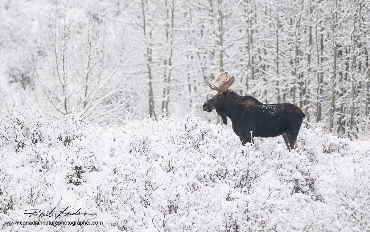
Moose photographed north of Calgary on Bears Paw road in winter.
Design Basics
A Point
The simplest element of design is a point, which can be large or small. The point can be represented by a selected element or the main subject in a picture — a bird, person, animal, tree, a building and so on. The placement of the element greatly affects how we view and feel about it within the frame. Generally speaking, key points or elements will be most effective when they are positioned so that there is an unequal distance from each side of the frame. If you have more than one point or elements, the same principal applies: try to place the key elements so they all have unequal distances between them and the surrounding frame. The nice thing about this simple guide of unequal placement is that it there are many places within the frame that work. Placement of a key element or point in the center often is ineffective because we generally tend to find this central positioning boring. While some famous artists have indeed placed their subjects in the center of the frame, most of the times they did it deliberately rather than intuitively.

A simple compositional guide is to place your main subject an unequal distance from all sides of the frame. If you have more than one subject follow the same guideline. Top Eagle (point) in Banff National Park positioned an unequal distance from all sides of the frame.

With wildlife I suggest that most of the time the animals should be looking into the picture. Swift Fox (CS) in winter.
Rules and guidelines are essentially helpful suggestions as to what works most of the time, but not each and every time. Also, avoid placing the main subject too close to the frame edge, without giving it some suitable “breathing” space. In my picture of an eagle in a snowstorm, for instance, you can imagine many locations where the bird could be placed to compose an effective image,and for the most part the center of the frame is not one of them. Keep this principle in mind when you compose your own images
Line

Representing a “path” between two points, a line can be straight, curved, vertical, horizontal, diagonal, or zigzag. A line can imply motion and suggest direction or orientation, lines can also be implied – filled in by the mind when several points are positioned geometrically within a frame. Placing four dots on a page in the shape of a square can imply the points are linked, as the mind
searches for recognizable patterns, and the direction and orientation of a line can also imply certain feelings and emotions. Whereas horizontal lines imply tranquility and rest, vertical lines tend to project the sense of power and strength. Oblique lines imply movement, action and change; curved lines or S-shaped lines imply quiet, calm and sensual feelings; converging lines imply depth, scale and distance. A fence or roadway converging into the distance provides the illusion that a flat two-dimensional image has threedimensional depth. Lines are an effective element of design because they lead the viewer’s eye. To create more effective photographs, look for lines and try arranging them within your viewfinder to invoke specific feelings and provide the illusion of depth.
Morants Curve in Banff, National Park - note how you eyes follow the tracks into the picture.
Shape

Shapes are the result of closed lines. However shapes can be visible without lines when an artist establishes a colour area or an arrangement of objects within the camera’s viewfinder. Some primary shapes include circles, squares, triangles, and hexagons – all of which appear in nature in some form or another. For its part, space is defined and determined by shapes and forms whereby positive space is created by existing shapes and forms, while negative space is the empty space around shapes and forms. For images to have a sense of balance, positive and negative space can be used to counter balance each other. In the East, this concept is referred to as “Notan”, which is a Japanese word translated as "lightness-darkness". The Italian word is Chiaroscuro, which applies to the works of art distinguished by strong contrasts between light and dark. Simple elements of light and dark can be very effective tools of expression, as the edges between the light and dark areas catch our attention and prompt us to follow them subconsciously with our eyes. Whereas a gently curving edge is followed by our eyes slowly, a sharply curved edge is passed over quickly, generating a subconscious sense of movement. A photograph can show either balance or imbalance (tension) through the distribution of light and dark space. You can sometimes visualize these light and dark areas in a scene before you by squinting with your eyes. You can also visualize these areas of contrast in a photograph by converting the image into a high contrast lithographic. If using Photoshop open your image and follow the Select > Image adjustments > Threshold sequence to convert the image so that it shows only areas in black or white to view positive and negative space more easily.
Sunset at Go Home Bay in Georgian Bay 30,000 islands, Ontario.
Form

Form refers to the three-dimensional quality of an object, which is due in part to light, and dark areas. When light from a single direction (e.g. our sun) hits an object, part of the object falls under a shadow. Light and dark areas within an image provide contrast that can suggest volume. Factors that can affect our feelings towards an image include the direction of the light source, from above or below, and the gentleness or abruptness of the half-tones. Light coming from behind a subject can form a silhouette – resulting in object that is completely black against a lighter coloured background. Silhouettes appear as two-dimensional shapes lacking form. The absence of colour often enhances our perception of form in black-and-white photographs, or in outdoor photography taken during winter. Light emitted from above and to the side when applied to portraits creates what is often referred to as “Rembrandt lighting”, which emphasizes edges and depth. Effective use of oblique lighting in landscape photography – best captured early or late in the day –greatly enhances the natural texture of the landscape, especially when accompanied by warm or cool colour casts.

Rembrandt Lighting - Red Rock Coulee, Alberta.
Colour

There has been a tremendous amount of research done on how colour affects human beings, with many of the findings suggesting that men and women may respond to colours differently, as do different cultures. Colour affects us emotionally, with different colours evoking different emotions. Our perception of a single colour also depends on the adjacent colours. Understanding how to choose certain colours for inclusion in your photographs can help you make more expressive images.

Autumn on the Oxtongue River near Algonguin Park, Ontario.
The vocabulary of colour includes:
Hue: refers to the names of the primary colours, red, green and blue etc.
Value: lightness and darkness of the colour – the amount of white or black added.
Intensity: the purity or saturation of the colour.
Monochromatic colour: use of one colour where only the value of the colour changes.
Analogous colours refers to colours that are close together and seem to “get along” and are referred to as being harmonious. Analogous colours are often used in visual design to create a soothing affect.
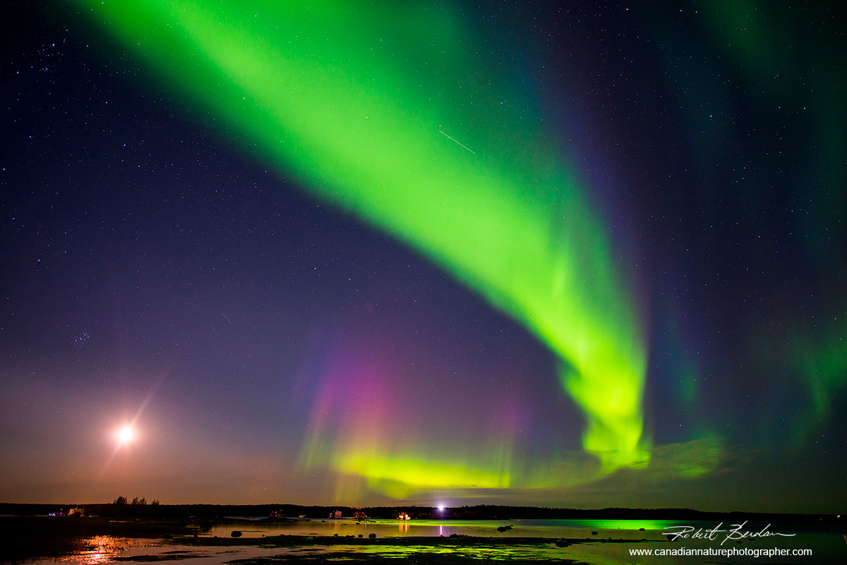
Aurora borealis over Yellowknife Bay, NT.

Frame Orientation and Shape
One of the first choices a photographer needs to make when taking a picture is the orientation of the frame – horizontal or vertical. The orientation of the frame exerts tension or pull within the view. A horizontal frame pulls and directs the viewer to look left to right, whereas a vertical picture directs the viewer to look from the bottom to the top. If you select a square format, the pull (tension) is equally distributed throughout the frame. Some photographers prefer a square format for portraits, while a few use it for landscape photographs.
Series of prairie landscapes with a 3:2 aspect ratio showing how the position of the horizon in both horizontal and vertical formats affects the picture. Also shown is a square format, a panorama format and a 4:3 aspect ratio crop. Framing and placement of the horizon is important, experiment to see what gives you the best results. You may choose to crop your image differently after photographing it.
Your choice in frame orientation depends on your subject material and what it is you want to show in your picture. There is no reason you can’t crop your images afterwards and use any or all of the framing formats. Whenever I shoot, I remind myself to take both horizontal and vertical pictures to give myself more options. Naturally, most magazine covers tend to use the vertical format, which also works well for enhancing the sense of depth in a picture. Some photographers also like to use a panoramic format, which can be achieved by using a special camera or by stitching several images together. I sometimes like to use an ultra-wide angle lens (e.g. 8-mm fisheye lens) and then stitch the four images together to create a 360-degree panorama. I recommend you experiment by taking both horizontal and vertical images, using different framing as you go along to see how it affects your picture quality.

A field of lupines near highway 102 north of St. John, NB

Prairie scene taken by stitching 4 images taken with an 8 mm fisheye lens.
Placing the horizon
After choosing a frame orientation, the next step in landscape photography is to decide where to place the horizon. The key consideration here is to appropriate adequate space to the area of greatest interest. If the sky is spectacular, showing a rainbow or storm clouds, place the horizon low; if there’s nothing of interest, you can just crop it out, especially if the picture was taken on an overcast day. Most new photographers tend to put the horizon near the middle by default, but this generally only works when you have mirror reflections in water. To emphasize something in the foreground, shoot close to the ground and put the horizon high up in the picture. Likewise, if you want to emphasize the sky, put the horizon low in the picture. Choosing exactly where you place the horizon may also depend on what else you want to include in your frame.

Tonquin Valley, Jasper Nationl Park at sunrise - I placed the horizon about 2\3 high in the pictures to emphasize the foreground. I also used a 2 Stop grad filter to darken the sky and lighten the foreground.
Your choice of lens focal length will also play an important role in landscape photography. In general, landscapes favour wide-angle lenses (between 10-mm and 35-mm), whereas lenses offering longer focal length will compress both the foreground and the background – creating a flattening effect. If you don't own a wide-angle lens, you can always shoot a panorama by stitching a series of overlapping photos – shoot holding the camera vertical for best results – by locking the exposure and then overlapping each frame by about 30 percent. You can then use Photoshop, PTGui or other software program to blend all the overlapping images into a panorama.
Opapin Plateau on an overcast day in July lead me to crop the sky completely out of the picture.
Proportion and Positioning the Main Subject
One of the main guidelines in composition is that each photograph should have a focal point that you want the viewer to notice. More often than not, it should be positioned an unequal distance from each edge of the picture frame. Proportion, which refers to the size relationship of visual elements to each other and to the whole picture, is a key objective in this undertaking. One of the reasons proportion is often considered important in composition is that viewers respond to it emotionally, which is why proportion in art has been examined for hundreds of years – long before photography was invented.

Great Gray Owl on fence post in heavy snowfall. The owl is positioned an unequal distance from all sides of the frame. In order to get the owl sharp I had to focus manually because the falling snow "confused" the autofocus systme.
Many photographers and painters are aware of the so-called “rule of thirds”, whereby a picture is divided into three sections vertically and horizontally, with lines and points of intersection used as guides to position important visual elements. Moving a horizon in a landscape to the position of one-third is often more effective than placing it in the middle, but the horizon can be placed near the bottom by one-quarter or one-sixth. There is nothing obligatory about applying the rule of thirds. In placing visual elements for effective composition, one must assess many factors, including colour, dominance, size and balance, all within the framework of
proportion. There are times, of course, when a certain amount of imbalance or tension can make an image more effective. This is where we come to the artists’ intuition and feelings about their subject. Each of us is unique, and we should all strive to preserve those feelings and impressions about our chosen subject that are different from others’.

Three mule deer located at approximately 1/3 position in the picture.
On analyzing some of my favourite photographs by laying down grids (thirds or golden ratio in Adobe Photoshop), I find that some of my images correspond to the rule of thirds and, to a lesser extent, the so-called Golden Ratio of 1 to 1.618. However, many do not. Many digital cameras and video cameras now come with lines on their viewing screens – with many that can be turned on or off – which can be used as guides to ensure your subject is level, and to facilitate using the rule of thirds when composing. While helpful for beginners, remember that these lines are merely suggestions aimed at moving your main subject away from the center.
Golden Ratio
One proportion that is often cited as occurring frequently in design is the Golden mean or Golden ratio. Golden Ratio is Derived from the mathematical Fibonacci Sequence where each succeeding number after 1 is equal to the sum of the two preceding numbers – 1, 1, 2, 3, 5, 8, 13, 21, 34, etc. – the Golden Ratio principal has been used as a powerful composition tool in design for centuries. Named after the famed Italian mathematician Leonardo Fibonacci (1170-1250) the numerical sequence was actually known to Indian mathematicians as early as the 6th century, but it was Fibonacci who introduced it to the West. In mathematics, two quantities are in the Golden Ratio if their ratio is the same as the ratio of their sum to the larger of the two quantities, which is why the ratio formed from a + b divided by a to 1:1.618 is called the golden mean. If you were to take a rectangle and divide each smaller window within it again and again using the golden ratio with utmost precision to join their corners, you end up with a logarithmic spiral.

A golden rectangle with longer side a and shorter side b, when placed adjacent to a square with sides of length a, will produce a similar golden rectangle.

A golden spiral can be approximated by starting with a rectangle for which the ratio between its length and width is the golden ratio. After continuing this process the result will be an almost complete partitioning of the rectangle into squares. The corners of these squares can be connected by quarter-circles approximating a logarithmic spiral.

In nature the golden ratio and logarithmic spiral are found frequently in animal bones, horns, shells, and plants. It may be that we are genetically programmed to find this proportion pleasing. You can apply grids with the golden ratio, logarithmic spiral or rule of thirds in Photoshop using the crop tool and showing the grid layout. It may be helpful when you crop images to make them more effective. On the right you can see logarithmic spirals on the inside of this Ox-eye daisy (above diagrams used with permission from Wikipedia).

Where the lines interesect are suggested points for placing objects of interest.
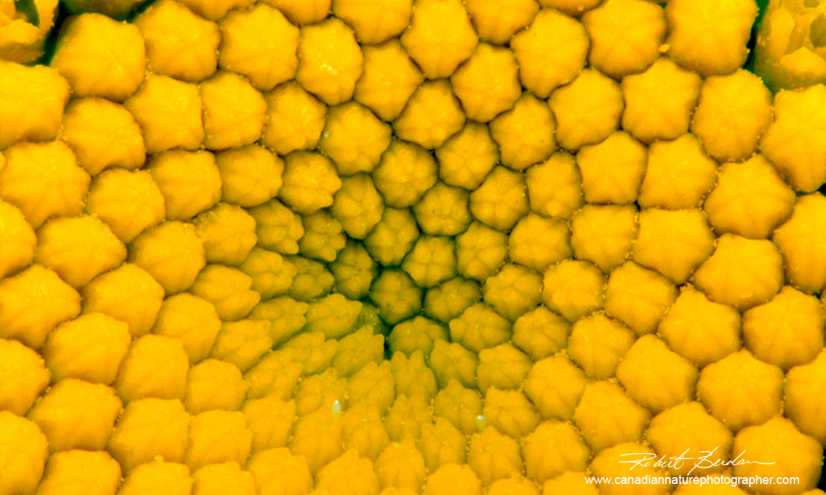
Ox eye Daisy showing logarithmic spiral originating from the center of the flower.
This logarithmic spiral is a frequently encountered motif throughout nature – often found in shells, horns, flowers, and throughout the human body. The Golden Mean, is sometime called Phi, also occurs frequently in nature, which may suggest that we are genetically programmed to
recognize this proportion as being pleasing to the human eye. There are studies of top fashion models revealing that their faces have an abundance of the 1.618 ratio, and the Golden Ratio was widely used by some leading Renaissance painters during the 14th -16th centuries. It is believed that a variation of this proportioning tool likely led to the Rule of Thirds. Whichever rule you apply, remember that proportion is an element of design that dictates where items might be placed within a frame. That said, never be afraid to experiment and try something different to learn from your successes and failures.
Balance & Symmetry 
Balance implies that the visual elements within a frame have a sense of weight. Large objects generally appear to weigh more than small objects, and dark objects appear to weigh more than light coloured objects. The position of the elements in the frame is a critical step. We tend to assume subconsciously that the center of a picture corresponds to a fulcrum, but a heavy weight on one side can only be balanced on the other side if the lighter weight is located at a greater distance from the fulcrum.

Sunset on pond along the Ingraham trail outside of Yellowknife,NT.
For its part, symmetry implies a sense of aesthetically pleasing proportionality that implies balance. There are three kinds of symmetry. The simplest is bilateral symmetry – where an image is duplicated from the top to bottom or left to right – such as a landscape that is reflected off a calm body of water and divides the image in half. Radial symmetry is often seen in flowers, while asymmetrical symmetry is found in “divided” pictures and has different elements on each side. Look for different forms of symmetry in nature.
Rhythm
Rhythm refers to the regular repeating occurrence of elements in the scene, just as in music it refers to the regular occurrence of certain musical notes over time. In photography the repetition of similar shapes sets up a rhythm that makes seeing easier and more enjoyable, soothing out nerves and stimulating our eyes to follow. To be most effective, rhythm requires some variability, as rhythm that is too similar or too perfect may be boring. When composing your images, look for repetition with variation. If you are photographing a fence, for instance, a mere repetition of elements with the same height will not hold a viewers’ interest for long, but
if you include some bent, broken, outsized or off-color fence posts along the way, you will generate more interest and curiosity.

Additional Composition Guidelines
1. When photographing animals or people, try to arrange them so they are looking or moving into the frame and focus on their eyes. Try to capture a catch light in the eye if possible.
2. The main subject should not be too close to the edge of the frame. Leave some empty space between the subject and frame border.
3. For landscapes, use a tripod to be more deliberate when composing the picture. Also check that the horizon is level, and that there are no distracting elements in the background.
4. Not all images have a main subject. The picture may be an interesting pattern or texture, such as tree bark or lichen on the ground.
Chaos vs Simplicity
Chaos is a disordered state of elements that is found frequently in nature. If you want to see chaos, point your camera at the branches of tree with no leaves or at clouds. There is a pattern, but it may not be apparent. The goal of many photographers is to take a picture that exhibits some underlying organization, so the viewer sees what the artists intends for them to see, but leaves enough chaos within the frame of the image so that the viewer has to put forth some effort to explore and fully appreciate the image. Some photographers include too many elements in their images, and they can improve their composition by removing unessential elements. At some point, however, an image that is too simple fails to hold one’s attention for long. A single leaf may be interesting to a brief extent, but it fails to hold my attention for long, whereas an image of the “forest” can be explored visually for extended periods of time. The ability to
introduce and handle complex elements within the frame of an image, while still producing effective composition, requires a maturation of seeing that takes time to develop – just as it takes time to appreciate more complex music. If you are interested in looking at photographs where chaos plays a key element in the composition I would recommend looking at the photographs by Elliot Porter (Nature's Chaos, 2001).

Last leaf to fall is an example of a very simple composition.

Two deer in forest is an example of Chaos in composition - can you find both deer?
The Importance of Light
I believe that quality, colour and direction of light are the most important ingredients in producing an effective photograph. Light can come from behind and form silhouettes, point in from one side to produce the “Rembrandt Lighting” effect, or simply pour in flat from the top. The quality and colour of light depends on the height of the sun and the weather. I personally like taking pictures during fog, which lowers the overall contrast and adds a sense of mystery and intrigue to any composition. In general, bad weather and any kind of unusual light can transform any scene into something spectacular. For their part, sunrise and sunset both offers unique colours and directional light, which makes it a favourite time for many nature photographers. During the middle of a sunny day, light comes down from above to create deep dramatic shadows, which I find works well for panoramic photography and the classic
“postcard” photos. I tend to scout for good locations in the middle of the day and then return later when the light is more interesting. You will also find unusual light formations before,during or after a storm, while overcast days can produce beautiful soft lighting for taking macro shots, fall colours or for photographing flowers and mushrooms.


Above examples of light rays coming through fog in the early morning.
The more often you head out with your camera, the better your chances are of encountering unusual and beautiful light. At sunrise, when the sky is properly exposed, the foreground is often too dark or underexposed. To fix this, use a two-stop neutral density grad filter to darken the sky and balance the sky exposure with the foreground. Alternatively, you can take several different exposures so the foreground is exposed properly, and then combine the dark and light photos into a high dynamic range photo using software to get a picture that looks close to what you saw with your eyes. If you shoot RAW image files, it’s also possible to simulate adding a graduated filter using Photoshop in Adobe Camera RAW or in Adobe Lightroom. Most books on Photoshop or online tutorials will show how to do this. Personally, I try to avoid using coloured graduated filters and other gimmicky filters for nature photography. There are plenty of other digital techniques – such as using luminosity masks – a skilled Photoshop user can employ to make the images look closer to what they actually saw.

Moraine Lake, Banff National Park, Alberta - panoramic photo.
Summary
The elements of design are similar to scales in music; they are starting points for creating effective images and are only guides. Understanding how these elements can be used to compose an image will help you become a better photographer and provide a framework in which to evaluate photographic images. This essay is from Robert's book available as printed version or ebook on the front page of this web site "The Art of Canadian Nature Photography".
Authors Biography & Contact Information

Robert Berdan is a professional nature photographer living in Calgary, AB specializing in nature, wildlife and science photography. Robert retired from Cell\Neurobiology research to take up photography full time years ago. Robert offers photo guiding and private instruction in all aspects of nature photography and Adobe Photoshop training - including photomicrography, macrophotography.
Email at: rberdan@scienceandart.org
Web site: www.canadiannaturephotographer.com
Phone: MST 9am -7 pm (403) 247-2457.